NEX Work aims to increase the number of people who become referrers on their platform. Currently, there are 90 referrers, and they plan to increase that number to 200 within the next six months.
The NEX Work website is not currently aligned with its core value of prioritizing the needs of referrers before applicants. Additionally, the number of referrers on the platform has been increasing slowly.
The challenge we face is how might we convince people to become referrers.
Let's see the before and after!
Would you like to sign up to become a referrer for NEX Work?

 See Final Design
∙ Usability Testing
∙ Interview
∙ Define Challenge
∙ Persona
∙ IA
∙ Ideate Solutions
∙ Lo-fi Wireframe
∙ Mid-fi Wireframe
∙ Iteration Design
∙ Mockup
∙ Prototype
∙ Usability testing
∙ Design Spec
There are four phases in our plan. The first phase has been completed, and we have just entered the second phase to complete and improve the flow.

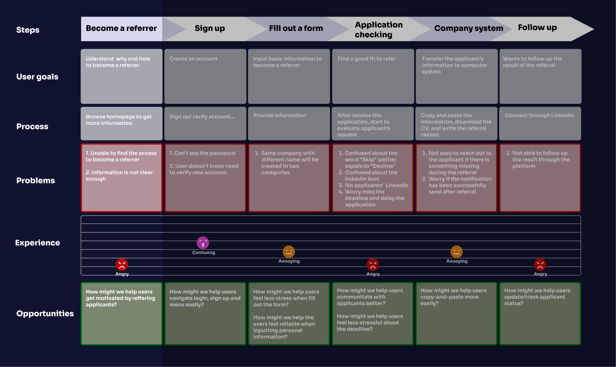
We created a journey map to show how referrers use our platform. To get more people to sign up, we need to focus on the first steps of the sign-up process, especially the "Become a Referrer" section.
See moreWe had a brainstorming session and came up with many ideas. We used the ICE scoring model to decide which ones were most important, and we found that updating the homepage was the top priority for the next step.
See moreWe plan to update our homepage to provide users with a quick and easy way to understand why they should become a referrer.
I conducted three interviews with professionals aged 25 to 30 who are enthusiastic and have the experience to help refer someone.

Based on the results of interviews, the following insights and pain points have been identified in the homepage.

Users are not clear about the benefit of becoming a referrer.
It is essential to highlight the three primary motivations behind why people choose to become referrers: empathy, bonus, and networking.
Referrers are curious and confused about NEX Work.
It would be beneficial to alleviate people's concerns by creating a Frequently Asked Questions (FAQ) section.
Lack of credibility
Provide convincing statistics, such as how many applicants have successfully got their first interview from our referral platform.
No direct access of being a referrer
Two CTA buttons for two different type of users, referrer and applicant.
I created three different versions of the homepage to see which one better fits the needs of users
There are two reasons why I combined the homepage and FAQ section on the NEX Work platform. First, I wanted to ensure that potential referrers are immediately presented with the reasons why they should join the platform, as well as provide them with quick access to answers for any questions or concerns they may have. Second, since we have a limited amount of content in our FAQ section, combining it with the homepage makes the information clear and easy to navigate for users.
In order to ensure the convenience of future feature development, such as search and filter options, the company listings have been placed on a separate page.

While I have moved other questions to a separate page, I have ensured that the most crucial message, which is "why should you become a referrer on NEX work platform?" is still prominently displayed on the homepage.
By implementing an auto-load feature, users can browse companies directly on the homepage without having to navigate to a separate page.

The homepage features three buttons: "For Referrers," "For Applicants," and "See Companies." Users can select the button that corresponds to their role and proceed to complete the relevant user flow.

We conducted a simple interview with four users using mi-fi wireframes. Based on the results of the iterative design process, we have decided to proceed to the next step with version 1.

3/4 users prefer version1
Familiar and easy structure

The FAQ has too much text
Clear image expression in FAQ
Won’t click the FAQ button
Too much info on the hero content
Unique design
Confusing flow
Flow ends abruptly
Based on the feedback we received from the iterative design process, we revised version 1 and developed a new design.
It is now appropriate to transfer the design to the development team for implementation.
See moreAccessibility is important because it ensures that everyone, regardless of their abilities, can access and use the same information and services, and participate in the same activities
See moreWhen designing the button, I encountered a challenge in balancing aesthetic and accessibility. While adhering to the green and blue color palette, there were limitations in creating the button design. To overcome this, I employed a diverse range of colors and contrast ratios to ensure the text was legible for those with visual impairments, while also making the design more visually appealing.
We are currently in the second phase of the project, and will continue to focus on improving the flow for referrers and applicants. In accordance with the ICE priority model, we will be moving towards closing the loop, which includes developing a "follow-up" feature to track the success rate of landing an interview.

IKEA Place App